Work
CASE STUDY
Simplifying
healthcare
complexity
WORK
ilumed
PROJECT
ACO Reach — A New Medicare Model
SERVICES
PROVIDED
B2B Marketing
B2C Marketing
Strategy
Branding
SEO
Web Development
Thought Leadership
Media


The need
When ilumed had the ambitious task of introducing a new Medicare model, we crafted a joint B2B/B2C marketing strategy designed to simplify complexity and connect on the human level. We leveraged functional and emotional audience insights to make the model accessible and showcase ilumed’s value proposition to providers and patients alike, proving the power of balancing empathy with clarity.
What we did
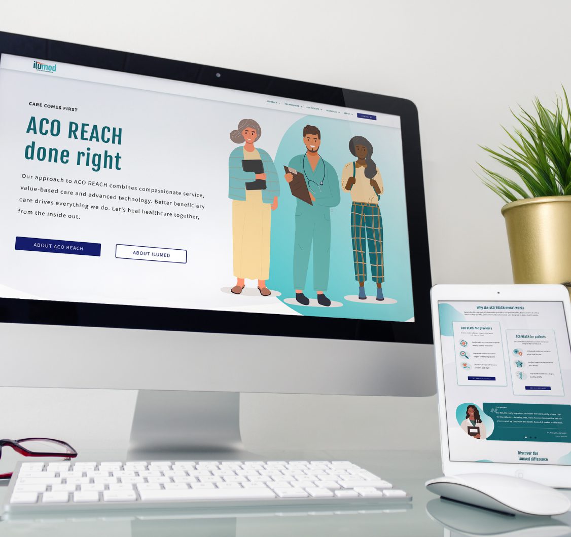
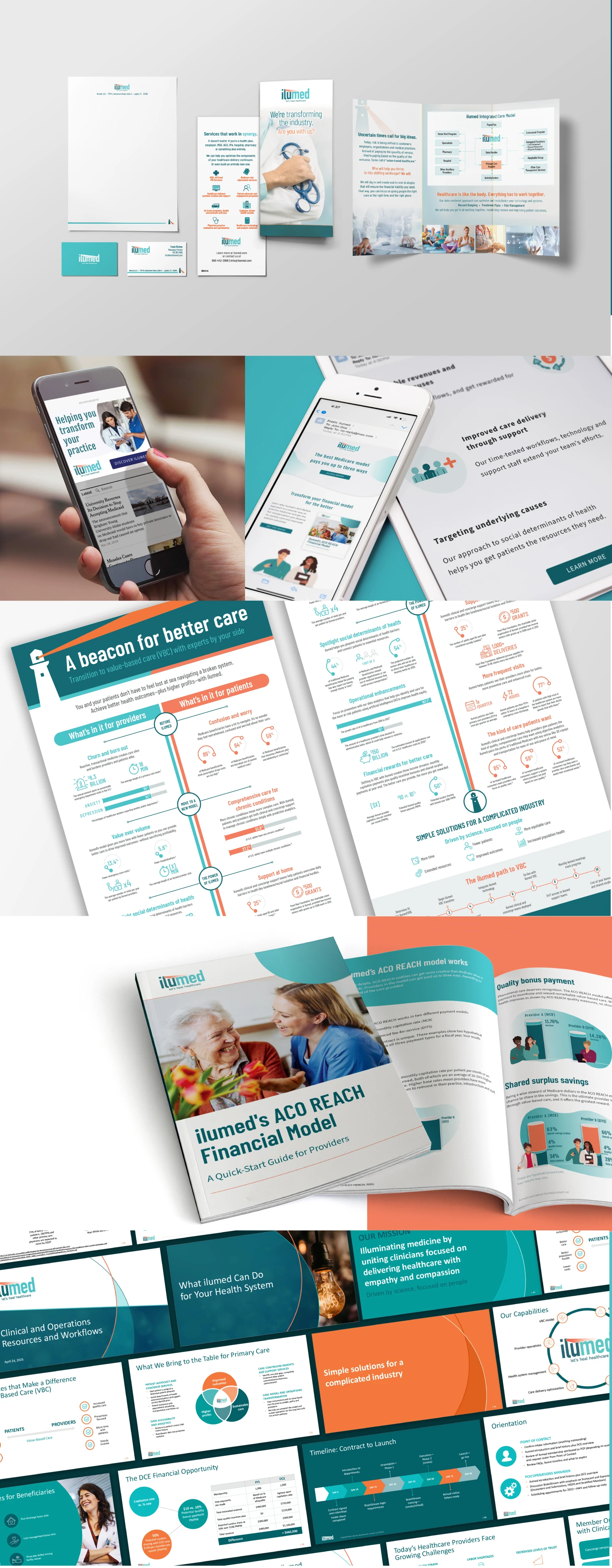
The new model warranted a new website and content strategy. Our digital and creative teams focused on building a best-in-class website experience that simultaneously educated and engaged B2B and B2C audiences.
SEO played a key role in the new website copy and content strategy, helping to drive organic search results and position ilumed as a top-tier ACO REACH thought leader. We capitalized on ilumed’s combined 300 years of healthcare experience to create ghostwritten articles on every aspect of ACO REACH, from care delivery to financial stability, healthcare operations to health equity. We used content as a lead magnet for providers weighing which Medicare model to enroll in.
The Results
Providers fuel ilumed’s path to profitability. Having more contracted ilumed providers means serving more beneficiaries. At the same time, providers must clear a high bar to participate in the ACO REACH model. So we doubled down on attracting qualified provider leads to the site and saw a 37% increase in users and a 27% form-fill conversion rate, which led to almost one and a half times more year-over-year beneficiary growth.
27%
form-fill conversion rate
146%
year-over-year beneficiary growth
WHY THE CLIENT SMILED

“The Heinrich team killed it and I’m excited to see how we moved the needle this year.”
— Anthony Layfield, AVP at Humana
THE FULL
story
A new welcome mat
Healthcare providers and patients face the same challenge: a broken healthcare system. For providers, that means working harder for less money and worse outcomes. For patients, it’s worse experiences and outcomes for higher costs. ilumed heals healthcare from the inside out by creating more sustainable revenue streams, improving healthcare delivery, addressing health equity and reducing costs.
We saw that a new website would give us the chance to tell a new, simplified story, laying out a warm welcome mat for providers and patients by showing ilumed’s unique approach to healthcare delivery.
We developed a clear, accessible voice, speaking to providers’ and patients’ biggest pain points and how ilumed solves them. We brought ilumed’s commitment to empathy and data to life with succinct, yet compelling, copy that feels personal.
We designed the site to showcase ilumed’s expertise and commitment to patients. Animations and interactive elements deliver the story on ACO REACH and ilumed in bite-sized moments. Illustrations and iconography give the site a hand-drawn feel, subtly showing ilumed’s commitment to care in action.
Shifting provider’s minds and practices
Getting providers to pay attention is no easy feat—they’re so busy working in their practices they have almost no time to work on their practices. So we decided to harness the information that’s only in the ilumed team’s head when it comes to improving provider operations, finances and care delivery. As a result, ilumed has become a go-to destination for high-value, original content providers want and need to sustain their practices and improve patient outcomes.
We make it happen by interviewing ilumed’s internal subject-matter experts and drafting thought-leadership articles on their behalf. We take on the heavy lifting developing and executing the content marketing strategy so the ilumed team can focus on what they do best—supporting providers and patients. Meanwhile, ilumed’s leaders gain credibility and recognition in the sector as trusted experts in the ACO REACH model.
Powering ilumed’s position
Heinrich enhanced ilumed’s brand positioning with thoughtful, human-centered design, messaging and thought-leadership content. We used strategic audience insights, along with SEO, not just to move the needle on ilumed’s profitability but to supercharge it.
See the latest
Ready to talk shop?
CASE STUDY
One campaign.
One jingle.
52 million impressions.
WORK
WYDOT Governor’s Council on Impaired Driving
PROJECT
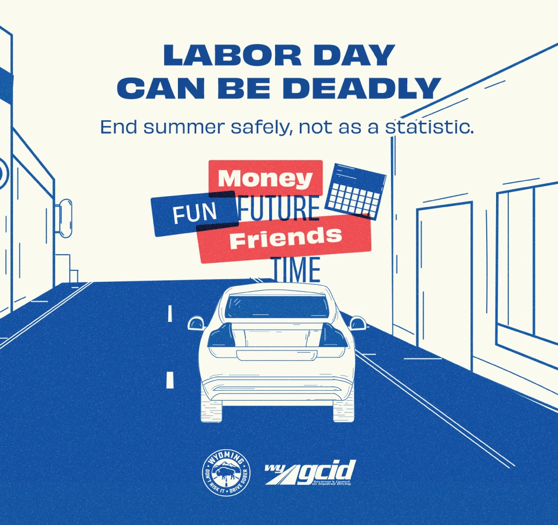
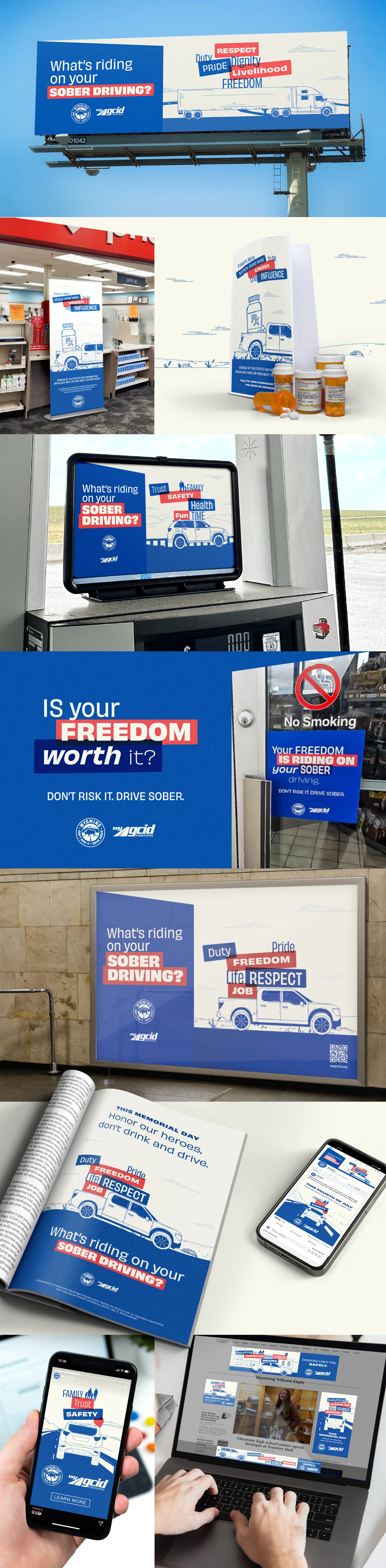
What’s Riding On It Campaign
SERVICES
PROVIDED
Strategy
Creative
Video
Media

The need
Colorado’s northern neighbor has a problem, and they want to fix it. As the state with the nation’s highest rate of drunk driving deaths per 100,000 people (according to the National Highway Traffic Safety Administration), it’s clear something in Wyoming needs to change. Unfortunately, many Wyomingites reportedly think they’re okay to drive after drinking 1–2 beers but given the average BAC (at time of DUI arrest) is double the legal limit, people are clearly underestimating their level of intoxication. The silver lining? Even though this culture of DUI tolerance exists, 85% of residents see this as a serious issue within their community. Which is why the Wyoming Department of Transportation Governor’s Council on Impaired Driving enlisted Heinrich to create a campaign that would increase awareness of impaired driving to hopefully decrease incidences of crashes, injuries, and fatalities caused by alcohol impairment.
What we did
Getting people to change a culturally accepted behavior is a challenging task. Before we could even begin our creative concepting, we had to figure what—if anything—would motivate our audience to stop driving under the influence. So, we asked them. Through our six statewide listening sessions, we learned directly from Wyoming residents which factors would make them think twice before getting behind the wheel after consuming alcohol. When it came down to it, family, career, freedom, and duty topped the list. We also learned that 50% of fatalities in WY involve non-residents, and we need to target our campaign at tourists, as well as people who are just passing through, such as commercial truck drivers. Armed with these insights we created a campaign (and a damn-catchy tune) that included video, radio, digital, and OOH aimed at changing social norms while encouraging people to ask themselves, “What’s riding on your sober driving?”
The Results
Using a media buy focused on reaching audiences 21+ statewide, with an emphasis on counties with the highest incidences of impaired driving, our non-threatening-yet gets-you-thinking campaign made quite an impression. 52 million of them to be exact. And the cherry on top? Our client even made our jingle his ringtone, (which we’re sure his coworker’s loved).
52M
total impressions
WHY THE CLIENT SMILED
“This is one of my favorite Heinrich campaigns. Right on point and a catchy song, I can’t wait to share these! I’m still humming it to myself…”
See the latest
Give your brand a glow up
CASE STUDY
Setting a
foundation
to last
WORK
Trammell Crow Company
PROJECT
Elevon: Commercial real estate branding
SERVICES
PROVIDED
Research + Strategy
Brand Positioning + Messaging
Naming
Collateral
Social Media
The need
The Central Park neighborhood was once home to Denver’s international airport, and when that moved out of town, the area became known as a quiet place to raise a family. But with a new light rail stop, budding brewery scene, and robust restaurant and cafe options, this neighborhood is now brimming with opportunity and connectivity to town and country, providing more opportunities to a wider variety of people. Trammell Crow Company knew that and came to Heinrich for help with everything that would get that new story to the masses, including brand strategy, naming, verbal and visual identities, website development and channel executions. Seemingly straightforward (and fun), Heinrich jumped at the chance. The added challenge? Changing perceptions and showing Denverites that Central Park neighborhood wasn’t just for families anymore.
What we did
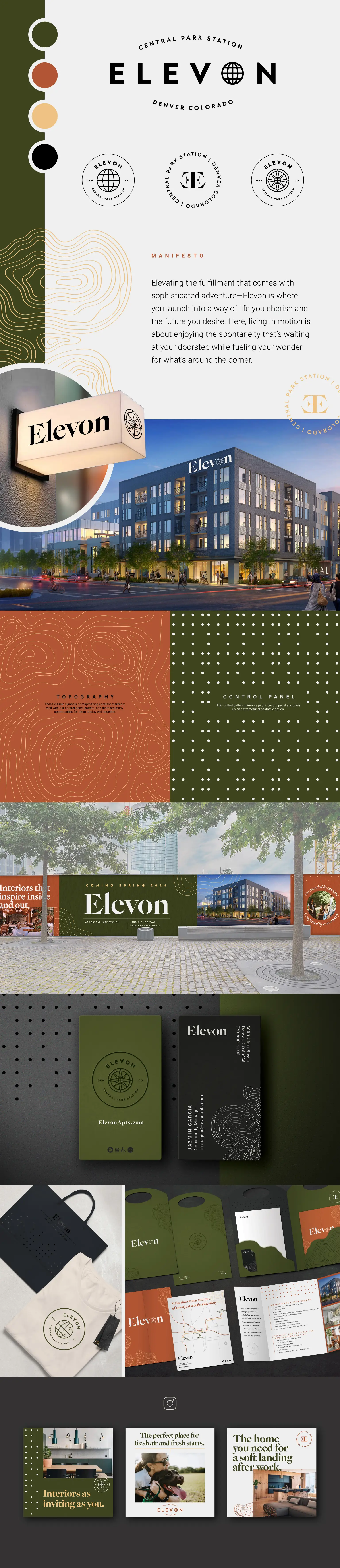
To get people excited about this locale, this brand had to inspire them away from Denver’s saturated, downtown apartment scene. With soaring competition, we focused on what matters to the people who prefer living in buzzing parts of town—a sense of spontaneity. We conveyed a bold statement to renters who worry that practical decisions could lead to a stagnant life, that these apartments hit the sweet spot of living a life in motion. Sculpting a brand strategy through research, competitive analysis and audience insights, we carved out intricate personas, positioning and territories. Using this information, we named this elegant, yet approachable community Elevon as a creative nod to the neighborhood’s historic connection to aeronautics. While always asking ourselves what would enchant culturally vivacious residents to flock to this side of town, the brand the visual and verbal identities took flight, and became enlivened with the tones, hues, and confidence necessary to create a story worth telling, Community collateral and signage was an opportunity to understand the neighborhood even better, as we had to ensure that every detail suited the apartments’ surroundings. And with beauty and precision, we landed on brand guidelines that are worthy of a window seat.
The Results
More important than winning Bronze in the Denver One Club Awards (which is pretty darn important), our client fell in love with the Elevon brand and how we’ve given the apartments wings to fly above the competition. Elevon has since been an inspiration for Trammell Crow Company as pre-leasing of the property is underway and is exceeding expectations.
Like any successful partnership, the process was equally rewarding creatively, revealing more about the spirit of the brand than we had anticipated—the surrounding community was an irreplicable source of inspiration.The up-front research and collaboration were particularly paramount to the brand development process, and the success of Elevon hinged on experience-laden tactics and laid the foundation for this brand to set itself apart in a category with ambitious competition.
WHY THE CLIENT SMILED
“Thinking of working with Heinrich? Do it! If you are looking for an agency to provide tight strategy, beautiful creative and to make your life easier I recommend Heinrich for the job.”
— MICHELLE VIOLANO REGIONAL MARKETING MANAGER, GREYSTAR
THE FULL
story
A deeper look at Elevon’s branding
With steep competition, we set out to showcase Elevon as a place to enjoy spontaneity at your doorstep while fueling wonder for what’s around the corner—a concept we hadn’t seen from other luxury apartments. Experience in real estate has taught us that location context is everything on these branding projects and the surrounding community of the Central Park neighborhood was an irreplicable beacon, guiding us along the way. Union Station and DIA are easy to get to thanks to the light rail stop and there’s an abundance of bars, cafés, breweries, shops, and hiking and biking trails. These opportunities and conveniences meant the world to our audience, and living a life in motion was paramount to their happiness and sense of self. So, we captured that essence, with style.
Strategy that puts life in motion
A sound strategic brand foundation is always a must, but especially so for real estate. Longevity is everything. Heinrich was searching for a balance between honoring the neighborhood’s legacy with its blossoming future. We started by analyzing the market, poking holes in what’s obvious and peering into what other real estate brands had been too timid to explore. We got to know the market and target audience like a neighbor, and a distinctive opportunity revealed itself: Heinrich needed to push this notion of living a life in motion even deeper. For our audience, a life in motion is lived in both a physical sense like access to activities (big in Colorado), and then, in an emotional sense when it comes to feeling a sense of fulfillment and optimism. We positioned Elevon as an incubator of a life in motion, whatever that sense of motion might look like for each resident. The name, voice, and story that followed reflected the sentiment that these homes can be both destination and departure points of for residents’ lives.
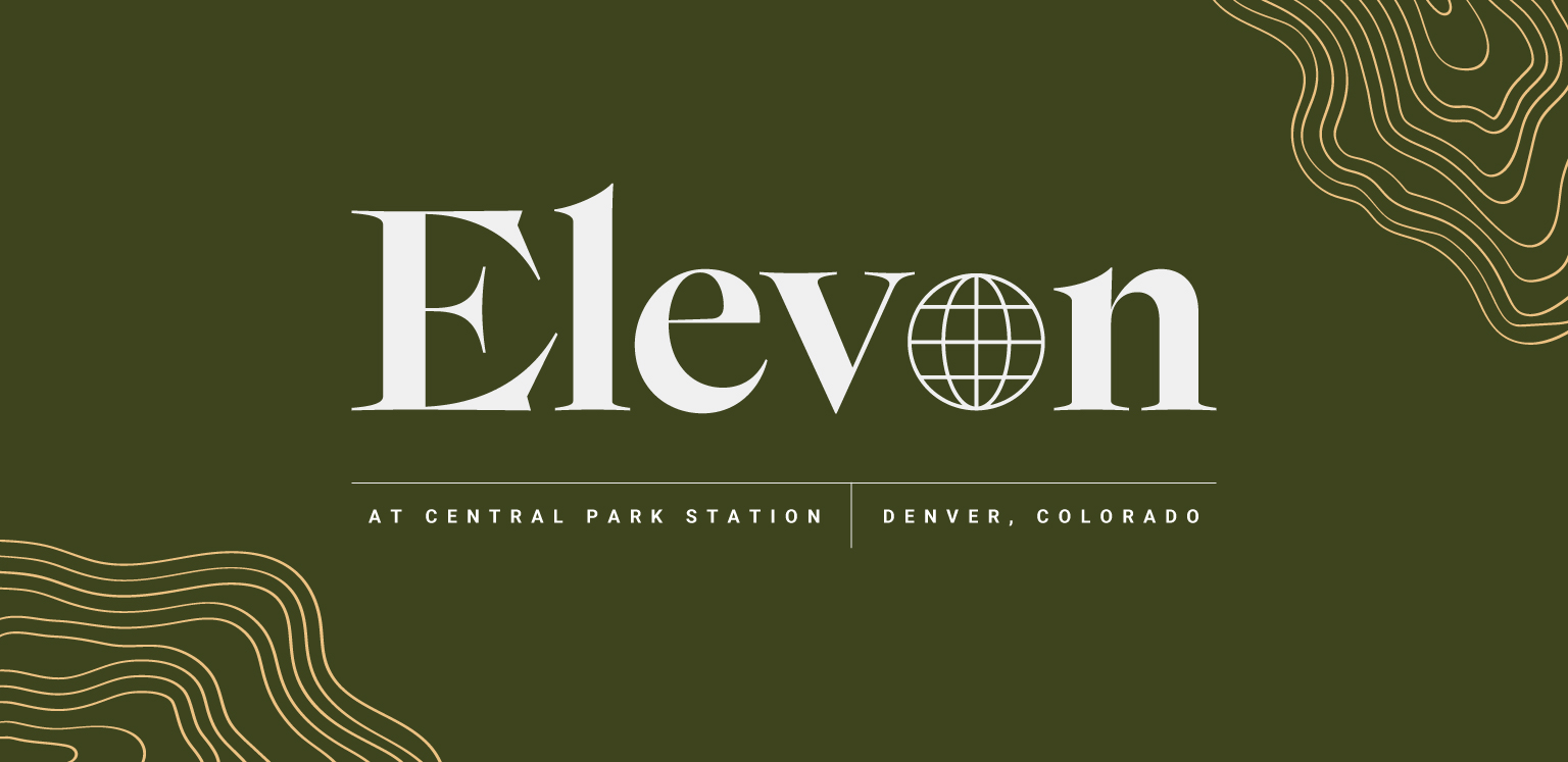
A name worth writing in stone
Originally a term for aircraft surfaces that combine the functions of two instruments for pitch and roll control, Elevon fosters a sense of cohesion to help residents keep their footing with work and all that Denver life has to offer. But how did we get to a name that encompasses all that?
Naming real estate takes a very nuanced, special creative skill set. And when a name must be written in stone, literally in the case of real estate, it must be as timeless and strong as the brand and building which bear that name. And we understood how much Trammell Crow Company was entrusting with us on this project. Heinrich researched and brainstormed thoughtfully to tactfully come up with a name. For real estate, a name must encompass culture, context, history, and sense of place. We might not have anthropologists on staff, but we have plenty of creatives that can research just as well to create a name that lasts.
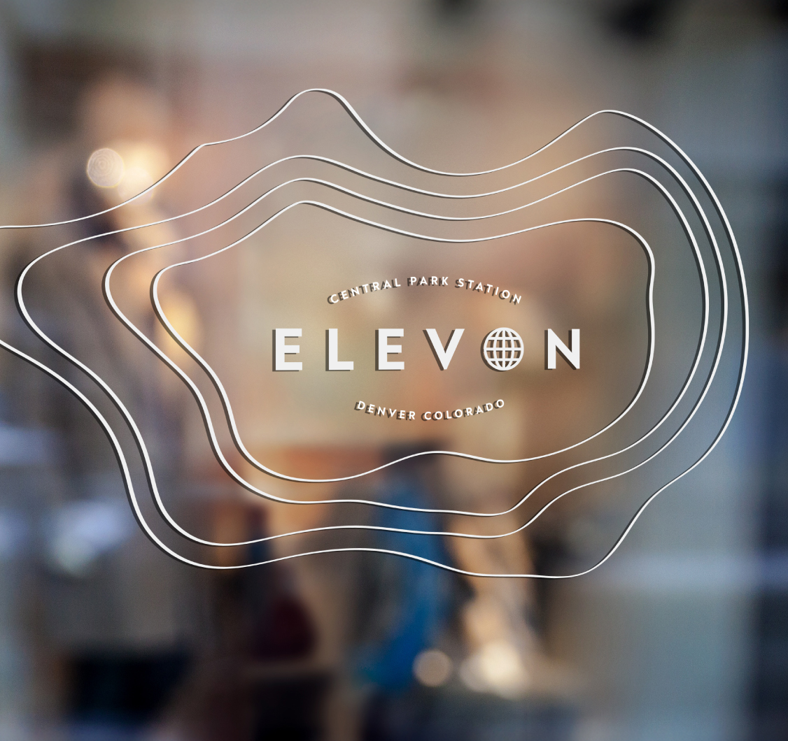
A visual and verbal identity as inviting as a neighbor
We captured a very special sentiment with this brand: Elevating the fulfillment that comes with sophisticated adventure—Elevon is where you launch into a way of life you cherish and the future you desire. So, how does that come alive through tone, imagery, and style?
Inspired by the take-off of an aircraft, the hero logo uses a font that has an upward motion typeface. With earthy, elegant brand colors and an intelligent but friendly tone of voice, residents know that they have a place to love, kick up their heels and reset for their next adventure. Going deeper, Elevon’s brand colors were selected to create a weighted balance between classic and new—honoring the duality between legacy and future for the neighborhood and residents. Additionally, we leaned into the history of the neighborhood and aircraft inspiration throughout our language choices: typography and visuals, using control panel elements like classic symbols of mapmaking contrast, and language that continually pushes the forward moving, life-in-motion strategic narrative.